blog
who are we?
Website Usability & Conversion Review
Jul 01, 2018
UX and Web Design Lessons from One Hour Translation
Service: Translation
Market: US
Goal: To get users to start a translation project
URL: http://goo.gl/dQ7PRT
Home Page – above the fold
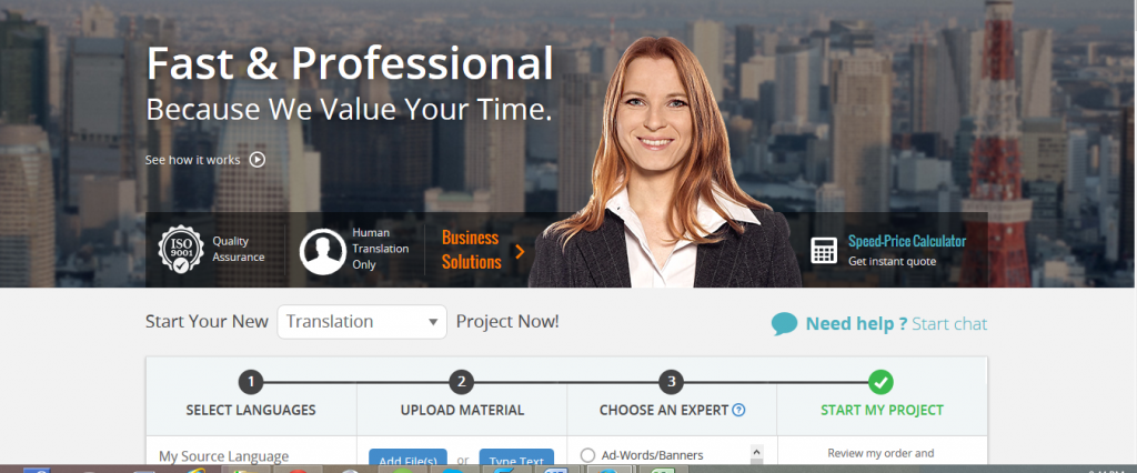
The “One Hour Translation” website is unique and does a great job on the usability and conversion optimization front. So let’s dissect the top portion of their homepage and see what they are doing right:
- The USP is clearly and prominently mentioned on the top of the home page – “Fast & Professional”.
- There is a quality assurance seal with the ISO 9001 badge just underneath the USP. This does a great job in eliminating concerns about the quality of their service.
- The “Human Translation Only” badge eliminates another common problem that most people seeking translation services face. Always anticipate concerns that your customers might have and address them with the appropriate message on a prominent section of your website.
- The real core of this website’s value comes from its ability to start a project by just selecting the languages, uploading the material, selecting the category, getting an estimated price, and initiating a project with just a few clicks. The 1, 2, 3 format is truly awesome and should help their conversion rates tremendously.
Learn more about Cactimedia’s web design services in Dubai
Home Page – below the fold
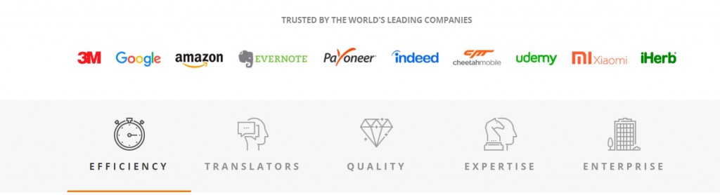
Right below the fold, they continue to do a great job building trust using the icons of their biggest clients – something definitely worth emulating.
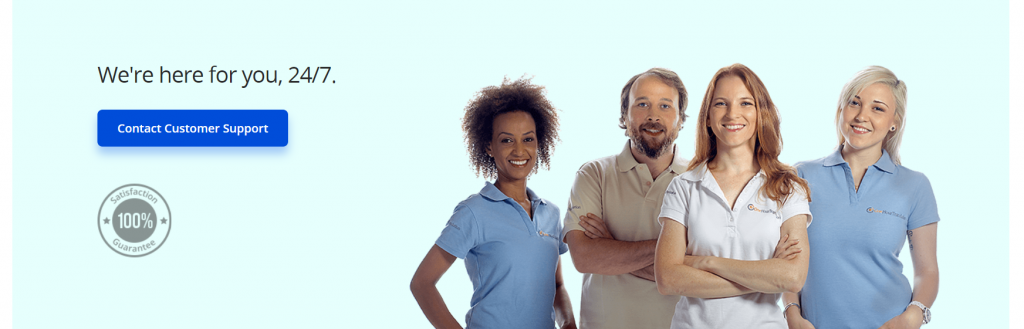
And just when you thought these guys were all about automation, they give their brand a human feel with this cool picture of their happy team. Also notice the contact information on the left and the clearly distinguished call-to-action.
Further down…
Scroll down even further and you will find a couple of testimonials and some more human faces – all good practices from a conversion optimization perspective. Also notice that they do a great job with keeping the call-to-action clearly visible throughout the homepage.
We think the team at “One Hour Translation” has done a great job with optimizing their website for conversation and usability. The more you study their website the more UX nuggets you will uncover. Take a look here: http://goo.gl/dQ7PRT
Or read another website usability review here.
Edited By: Michael Ilyas
All Categories
Ad Campaign
Company Branding
Content Marketing
Copywriting
E-Commerce
Hosting
Mobile
PPC
SEO
Social Media
Web Design
Web Development
Website Reviews
Similar Posts
-
Beyond Pretty Designs: 10 Web Design Strategies That Drive Leads for UAE Businesses
Feb 19, 2026
-
Everything You Need to Know When Selecting a Web Host for Your Business Website
Nov 29, 2023
-
The Importance of Website Load Speed and its Impact on User Experience
Sep 21, 2023
-
The Pros and Cons of DIY Website Builders
Aug 21, 2023