blog
who are we?
Website Usability, Web Design & Conversion Review
Jul 01, 2018
The Annuity Store Review
Business Type: Business Consultancy
Market: US
Goal: Generate Leads, highlight unique vale proposition
URL: http://theannuitystore.com/
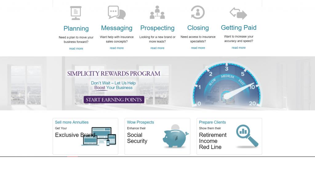
Home Page – above the fold

What they have got right:
- Phone number on the top right is a great idea as it builds trust and gives the user the option to just pick up the phone and call them at any point.
- Using sliders with text on the right is a great way to inform the user about what differentiates them from their competitors.
- Testimonial under the slider to build trust and social proof.
What they can do to improve:
- Probably not a good idea to use stock images on the homepage – it’s generally a big turn off and can kill trust.
- The call-to-action “Read more” is not doing enough considering where it is positioned on the home page. It would be great if they add the phone number right underneath the Read more button (something to the effect of “or call us now on 800-825-6094”)
Home Page – below the fold
What they have got right:
- Great job with the bullet points as it makes scanning the page easier.
- Great job with segregating the benefits into three sections – Duplicate, Deepen, Delegate.
- Call-to-actions at the bottom of each section are very good and should perform well.
- Implemented neatly from a web design perspective
What they can do to improve:
- The most important call-to-action should be visually distinguished from the others. In fact, all the CTAs are too subtle.
- There is a bit too much text under each section. It would be a lot better if they consolidate and tighten up the content a bit more.
Edited By: Avdhoot Shitre
All Categories
Ad Campaign
Company Branding
Content Marketing
Copywriting
E-Commerce
Hosting
Mobile
PPC
SEO
Social Media
Web Design
Web Development
Website Reviews
Similar Posts
-
Beyond Pretty Designs: 10 Web Design Strategies That Drive Leads for UAE Businesses
Feb 19, 2026
-
Everything You Need to Know When Selecting a Web Host for Your Business Website
Nov 29, 2023
-
The Importance of Website Load Speed and its Impact on User Experience
Sep 21, 2023
-
The Pros and Cons of DIY Website Builders
Aug 21, 2023