The EDA needed something that had a clean and professional look and feel but also for something that was not very standard. Several iterations later, Cactimedia came up with this http://eda.ac.ae/ - it’s a combination of professionalism and the latest web design tactics.
brief
what have we done?
User Experience
Multi Lingual
Web Design
Web Development

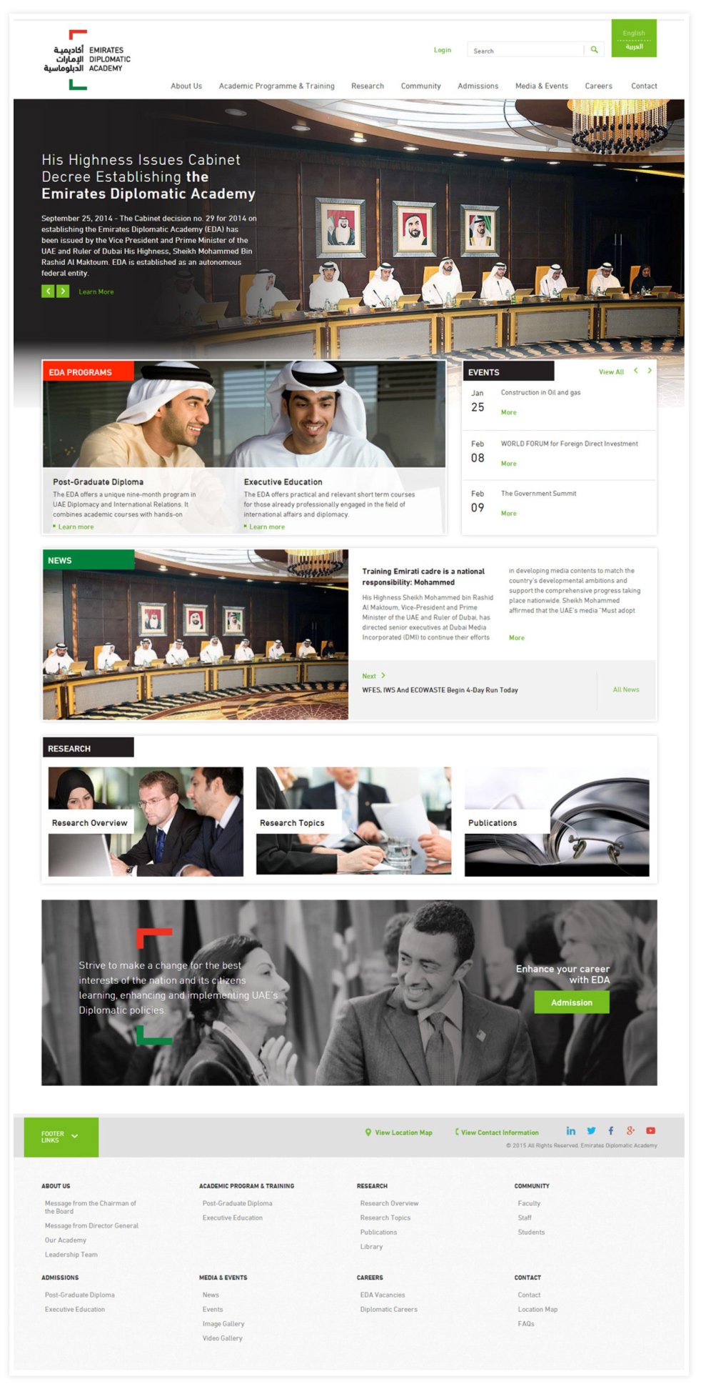
The menu is kept simple so that the broad end-to- end carousel and accompanying copy. Below the fold we added an events calendar so that users can see all upcoming events from the homepage.
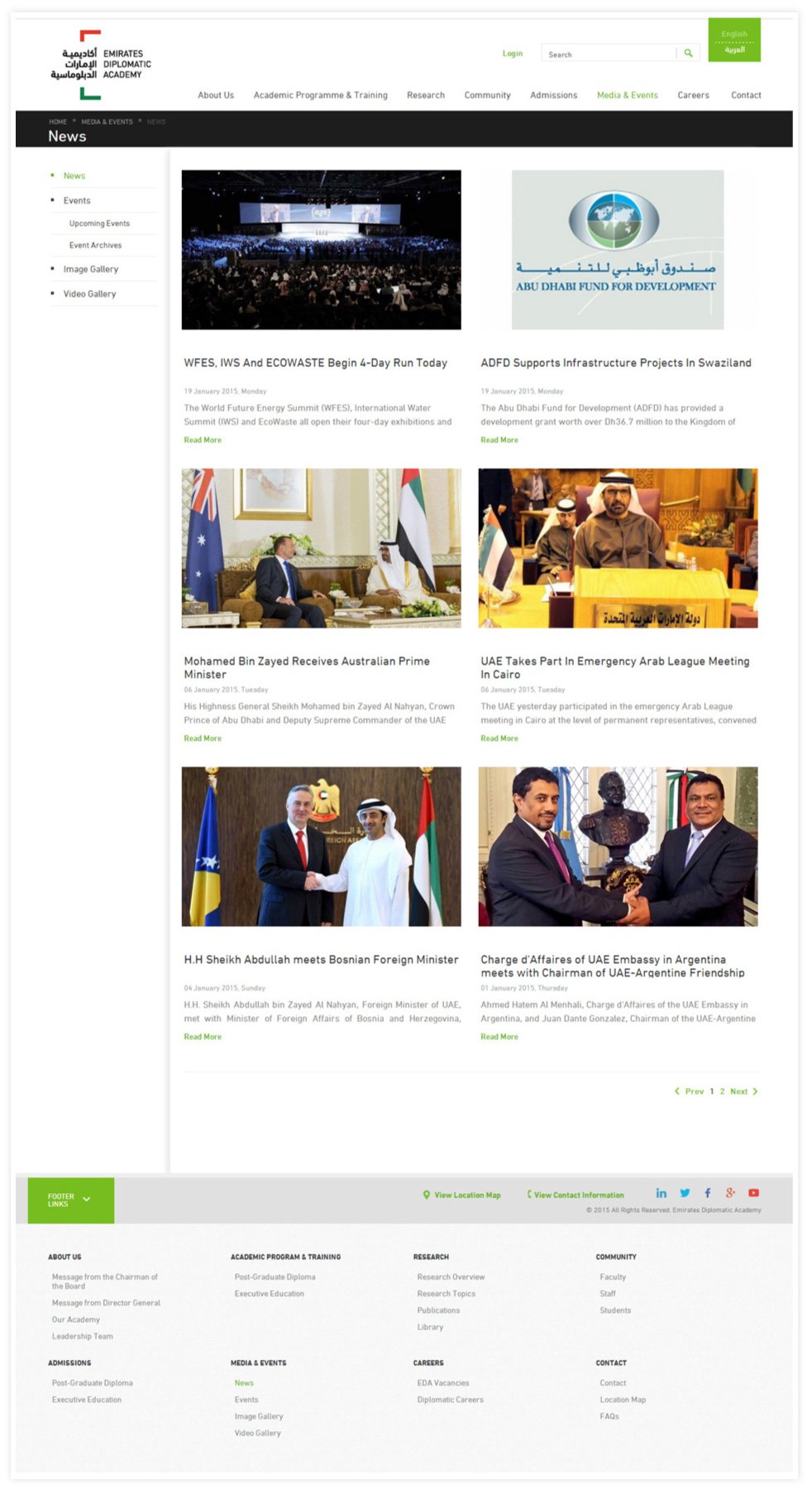
Other important elements such as the News section, the social sharing widgets and the research section and EDA programs section are also cleverly worked onto the homepage. The extended footer serves as a central location from where the user can see all the sections within the EDA website. We gave it a “spaced-out” look in order to make it easy to scan when looking for particular topics of interest.

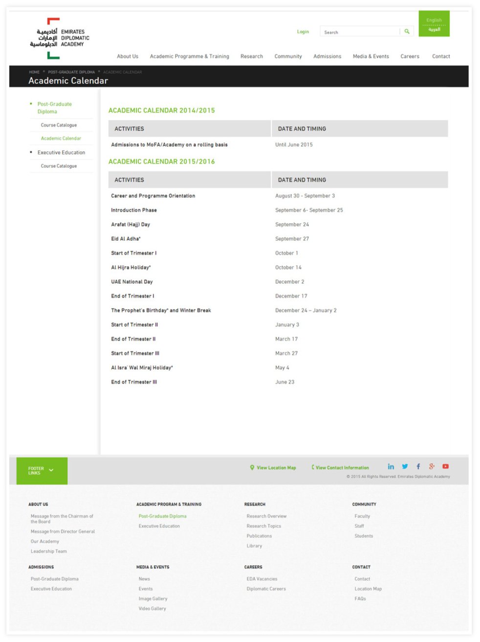
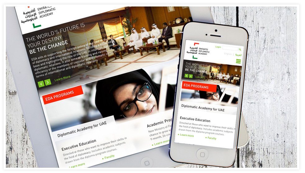
The EDA website has lots of breathing space and though we have worked in a lot of content on the Homepage, the fact that basic design principles have been adhered to, makes it easy on the eye. The information on the website not only does it work well in harmony with the design; it also has been structured in a logical and intuitive manner. The EDA website caters to both Arabic and English users and is designed to be responsive to all screen sizes.


