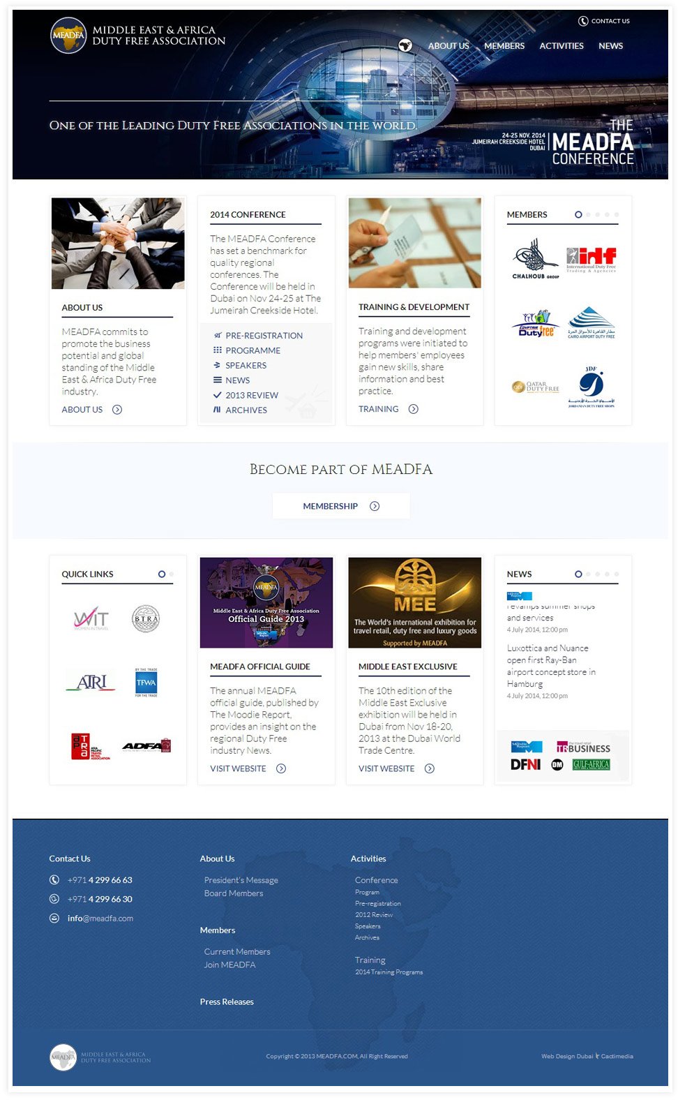
In terms of the design, we used a combination of blue and white to keep it professional, in line with contemporary designs and to get some good text contrast working in its favor.
brief
what have we done?

User Experience
-
Web Design
-
Web Development
-
Responsive
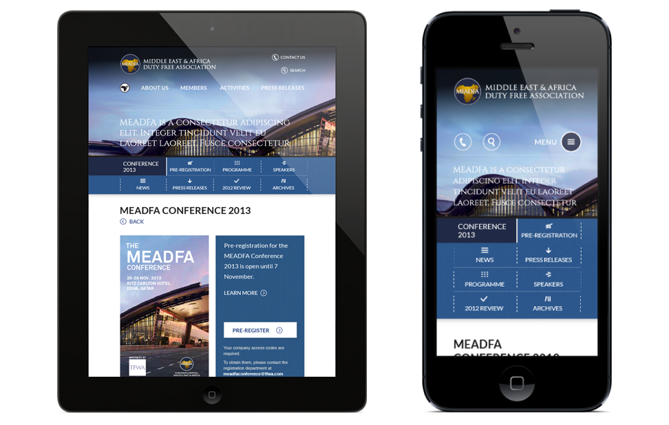
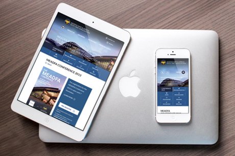
The website is also responsive, which means that it works equally well on all mobile & tablet screen sizes.
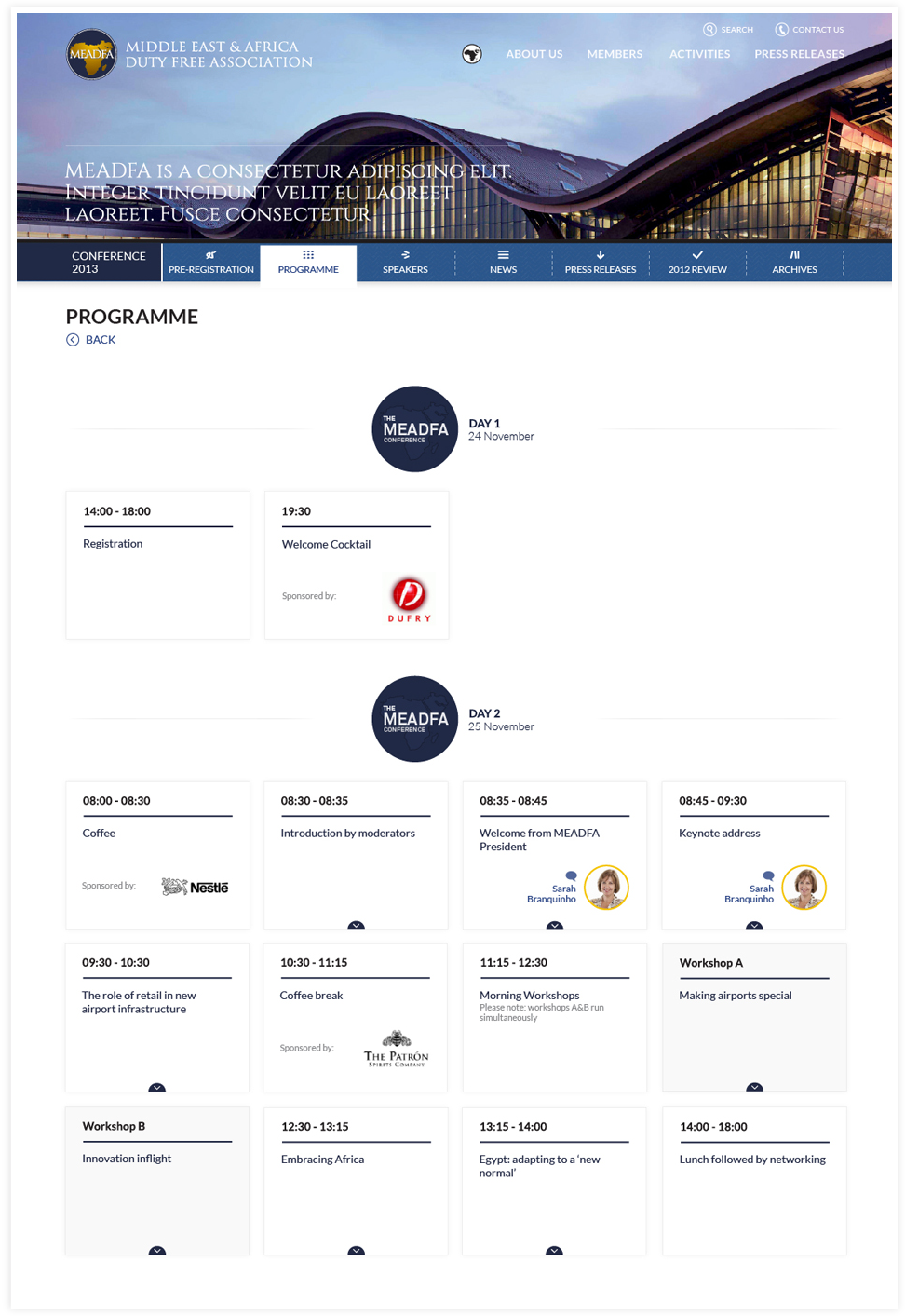
We determined that the visitors to the MEADFA website would come here to find information about their latest news, activities and events – and therefore it was important for them to be able to find whatever they are looking for quickly and effortlessly.
The messaging on the homepage has been kept clear and concise to cater to the average visitor’s short attention span.